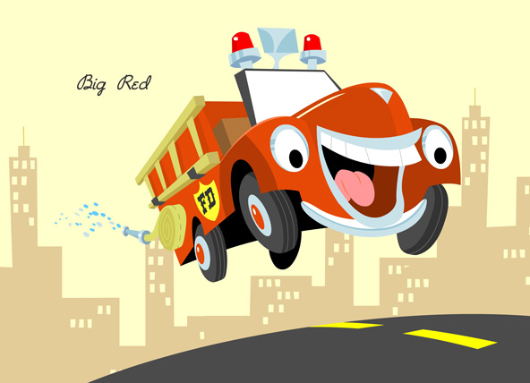
*Big Red designed by Jeff

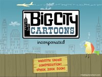 We finally got a chance to put somethin up on our Big City Cartoons website! Yeah I know it's just a splash but hey it's a start! Click the image to check it out, then if ya want bookmark it and check back in a few weeks for the launch.
 Here's a springboard setup from the "Big City Birds" pitchpack. In this episode, the birds visit some friends at the zoo and end up on the run from a crazy zookeeper who thinks they're exotic birds that flew their coop! Hilarity ensues when Finch and Maggie unknowingly hide out in the giant rattlesnake pit! Mucho props to my Big City pardner Jeff on this one for roughing out the killer rattler. Ain't it cool?
  Here's a nifty Flash/Photoshop combo. This one took a while to put together, but it was so worth it! There's definitely a little Kirby/Timm influence in there. Based on another wicked rough by Rob Davies. I'll probably do a couple more of these over the next few months.
 So I think I'm just about sold on the final design for Buckshot Billy's loyal steed Buckaroo. Here's the pencil sketches next to the finished model pack page - a great example of how rough sketches can be really pushed in Flash to be more dynamic. I'm playing with the idea of Buckaroo looking more like a toy when he's not in action - just to make it more obvious that when he is it's part of Billy's wild imagination. Maybe I'll do some sketches this weekend.
 Boy could I ever go for a bowl of this stuff. Here's the latest cereal box throwback. I didn't intend it, but the bear's a bit of a design mish-mash of Sugar Bear and Yogi Bear, ain't he? Oops! That tartan pattern on his scarf is a masked off image I found on the net. Cheesy as heck, but I love it. The hardest part of this one was that old skool Quaker logo. It took forever to get it right!
 5. Aging & Fine-tuning: Exported from Flash as a high res jpeg and brought into Photoshop for some texturing, noise effects and desaturation. I made my other cereal boxes kinda look like the front of the box was gently ripped off and scanned. I wanted this one to look more like an actual box that was placed face-down on a scanner. So, I backed off a little with the rips and folds and focused more on what the edges of an old box would look like head-on. I also added a city silhouette to give the piece a little more depth and interest. And I couldn't leave out the big, bold message to moms about vitamins!
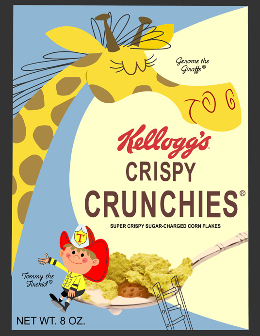 4. Revisions & Details: I took off the characters' outlines and cleaned 'em up a little, added some design elements to the characters, and flopped Tommy so he's now sitting facing Gerome - making the composition a little more balanced. I also added a ladder and swapped out my Flash spoon for a photo of a spoon full o' flakes that I found online and aged a little. Oh yeah- I came up with a decent cereal name and added some more text. Next I'll 'age' the finished piece a little in Photoshop so it looks all old school. Shouldn't take too long!
 3. Colour: Okay - I dropped in some colour and decided to change the box to a shade of blue so Tommy's firehat isn't lost (red on red). I also put the spoon from my Cowboy Crispies box in there (gotta love reuse). I'm having second thoughts about the composition though. Particularily the way Tommy is straddling the spoon. It's just not working for me. I'm going to have to try something else.
 2. Build and Layout: Here I worked out the composition and started building. I changed Tommy's placement to sitting on the spoon instead of Gerome, and rescaled the character's size relation a little. I also built the old school Kellogg's box (with real reference), the spoon outline, and laid down some temporary text (the cereal name will probably change). Building over my sketches in Flash is my favorite part of the process because it gives me a chance to re-evaluate my drawing and push things a little more. Next up, colour!
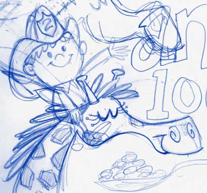 1. Idea & Sketch: Everything starts with a sketch (or usually in my case a rather sketchy sketch!) . . . Here's Tommy the Firekid ridin' his firefighting partner Gerome the Giraffe. He's also got an elephant with a big water tank on his back to help douse the flames, but I don't think he'll fit on the box... Anyway these fellers are part of another show idea of mine, and they're the stars of a new cereal box in the making. Check back later for Part II!
 Happy new year. Here's another cereal box mock-up. The plan is to do up a bunch of these bad boys then send em to the big three - Post, General Mills and Kelloggs - in hopes it'll spark a flame in them to return to the super-cool retro stylings of yesteryear. Who's with me?!


